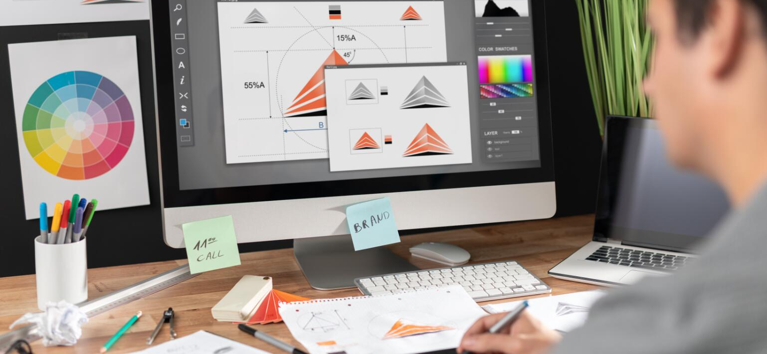
In today's era of information explosion, graphic design, as an important means of visual communication, plays the role of a bridge connecting brands and audiences. Whether it is advertising posters, product packaging, website interfaces or social media graphics, graphic design tells stories and conveys information with its unique visual language. This article will take you into the basic world of graphic design and explore how to use color, typography, graphics and other elements to create beautiful and effective design works.
1. Balance: Balance is one of the most basic principles in design. It refers to the visually stable state that a design element achieves, avoiding the appearance of being top-heavy or left-heavy. By adjusting the size, position, and arrangement of elements, visual balance can be achieved.
2. Contrast: Contrast is an effective means to enhance the visual impact of design. Through the contrast of color, shape, size, arrangement and other aspects, the focus of the design can be highlighted, the sight of the viewer can be guided, and the information can be conveyed more clearly.
3. Repetition: Repetition is the key to building unity and rhythm in the design. By repeating the same elements (such as fonts, colors, graphics, etc.), you can strengthen the overall sense of the design, making it easier for the viewer to recognize and remember.
4. Alignment: Alignment is not only an aesthetic requirement, but also an important means of improving readability. Proper alignment can make the design look clean and orderly, reduce visual clutter, and make information flow more smoothly.
Master the use of color
Color is one of the most intuitive and perceptual elements in graphic design. Different colors can trigger different emotional responses and psychological associations. In the design, according to the design purpose and the characteristics of the audience, choose the right color match. At the same time, pay attention to the color brightness.

